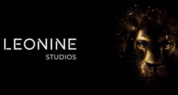
LEONINE Studios has revamped its corporate design presenting itself with an expanded word mark and a new look and feel. To more clearly describe the company’s range of activities, the word mark LEONINE was recently expanded to LEONINE Studios.
The new corporate design unmistakably and clearly conveys the corporate values and characteristics associated with the company name LEONINE Studios: Passion for content, courage, energy, confidence and team play. It was developed by LEONINE Studios together with the award-winning London-based agency SomeOne. The word mark LEONINE Studios is now enhanced with a striking lion’s head shaped from luminous light particles visualizing the company name LEONINE («lion-like») and creating high recognition value.
LEONINE Studios celebrates the element of light, which is the essential property in bringing the cinematic world of moving images to life – glowing and magical. This is what LEONINE Studios stands for as a provider of premium content with all its business units. In addition to the two existing primary colors of black and white, the color palette is expanded by two distinctive shades of gold referencing the optimistic golden light particles.
In addition, the logos of the group’s production companies appear under their established names and brands accompanied by the addition «A LEONINE COMPANY», making their group affiliation recognizable at first glance while keeping their individual brand identity. The same applies to the established labels of the group, their logos are complemented by the words «BY LEONINE».